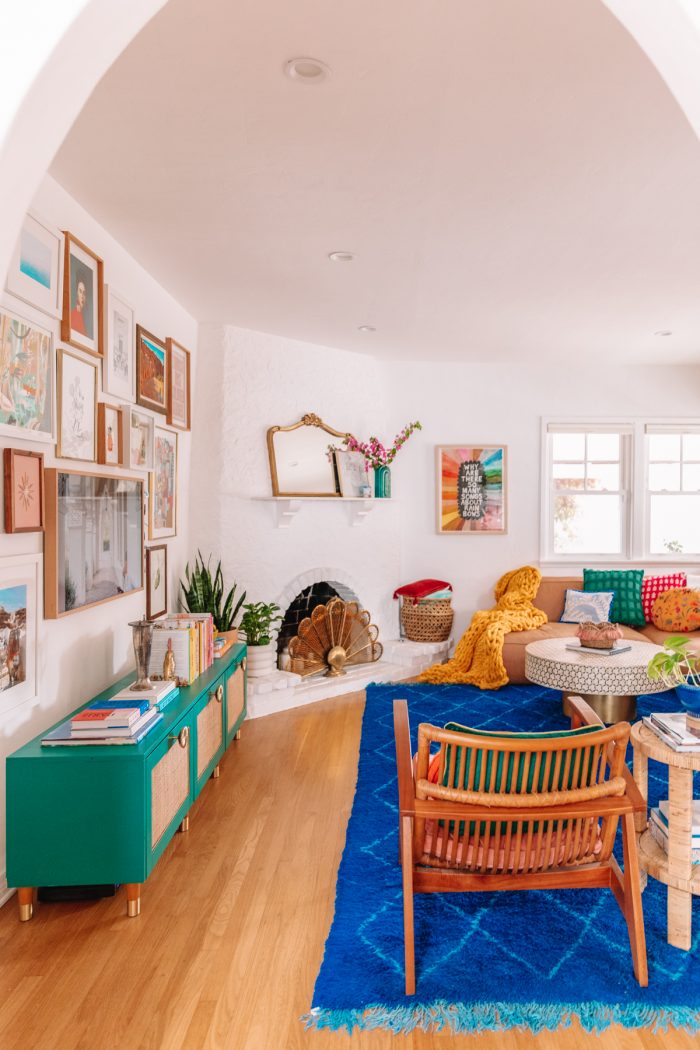
A little over three years after living in our 1930s home and I’m finally calling our bold, colorful living room complete! This room is the first room you see when you come into our home, and it was the hardest to layout as a result.
I wanted it to be a place where the colors we used throughout the rest of our home all came together. I kept the walls and the main furniture pieces neutral and layered on tons of color in our decor and accessories. And I’m so happy with how it turned out!
I’ll walk you through the process, our pain points and what we picked for every corner of this colorful living room that our family spends the most time in!
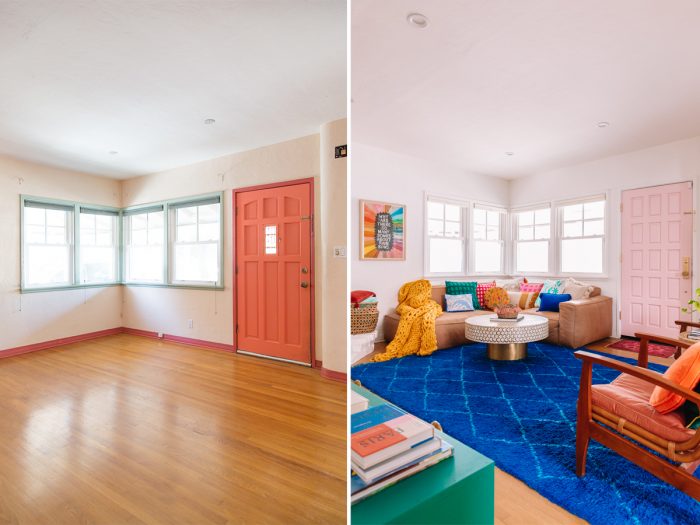
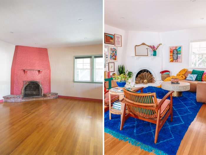
Before + After of Our 1930s Living Room
The main change we made to the living room was paint! When we bought our home, the walls were tan and the accent colors were red, orange and sage green. We gave everything a full coat of white and layered on color from there, primarily with furniture and accessories.
We unfortunately did have to sacrifice the original door for efficiency purposes, as it was deteriorating and no longer keeping out the (extremely) hot air here in Los Angeles. We ended up painting the new door pink (Dunn Edwards “Pink Pleasure”) and adding gold hardware, since gold and brass are the main finishes throughout the rest of the house.
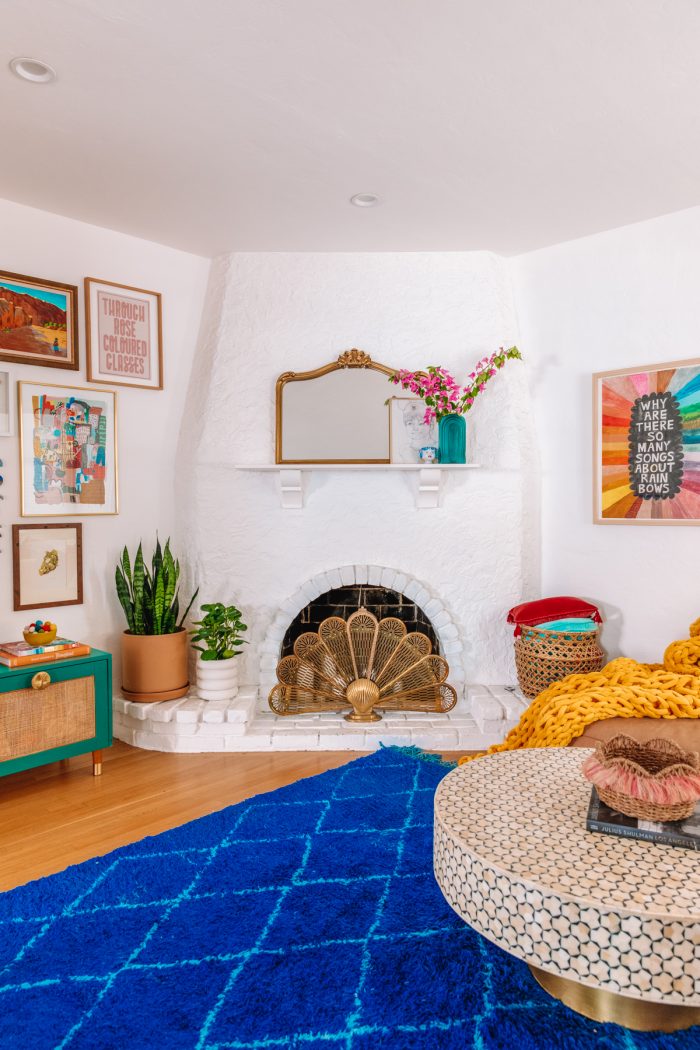
And yes, we did paint the fireplace and the brick! I know painting brick can be controversial in general (outside at least, is it controversial inside too!?), but I am not a fan of brick in it’s original state and we’re so happy with the white!
The fireplace is no longer functional and it was too expensive to make it functional so we simply replaced the mantle with a larger shelf, and filled the fireplace with candles!
Couches for Small Spaces + Awkward Layouts
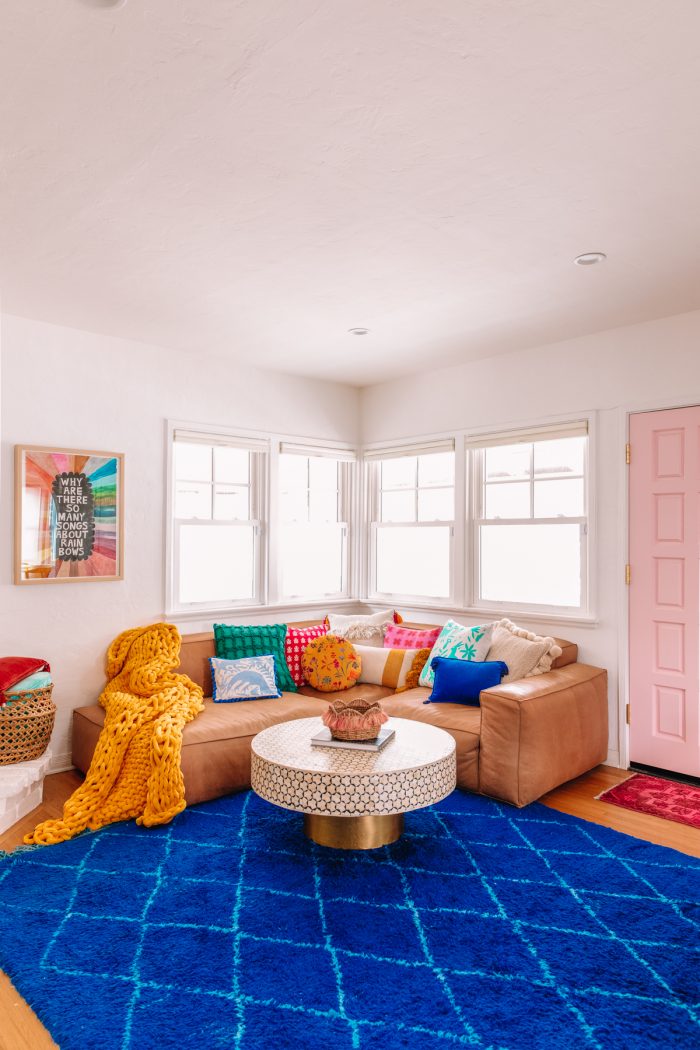
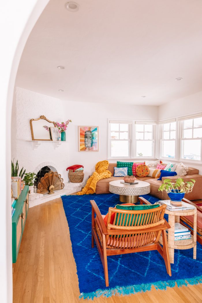
The biggest challenge in this colorful living room design was the layout! This space functions as a foyer, living room, TV room and playroom. While our house isn’t necessarily small, the bulk of the space is in the bedrooms leaving the living room on the smaller side.
We wanted to leave as much floor space open as possible, clear pathways from the door (we previously had a couch directly in front of the entrance and did not like it!) and our top priority was not putting our TV above the fireplace.
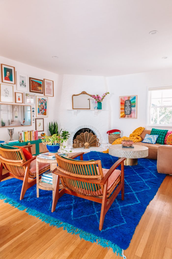
We ended up deciding on the far corner of the room and then went on a hunt to find a corner couch that would fit the space. We collaborated with Article and their Solae Canyon Modular Sofa. It allowed us to pick the exact pieces so that the sofa *literally* exactly fits in the space.
We knew we wanted a leather sofa as we do eat in our living room occasionally and we have a toddler and felt that leather would look better with age. We’re really happy with that choice so far!
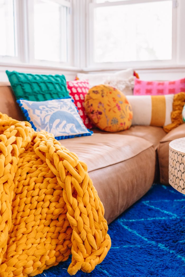
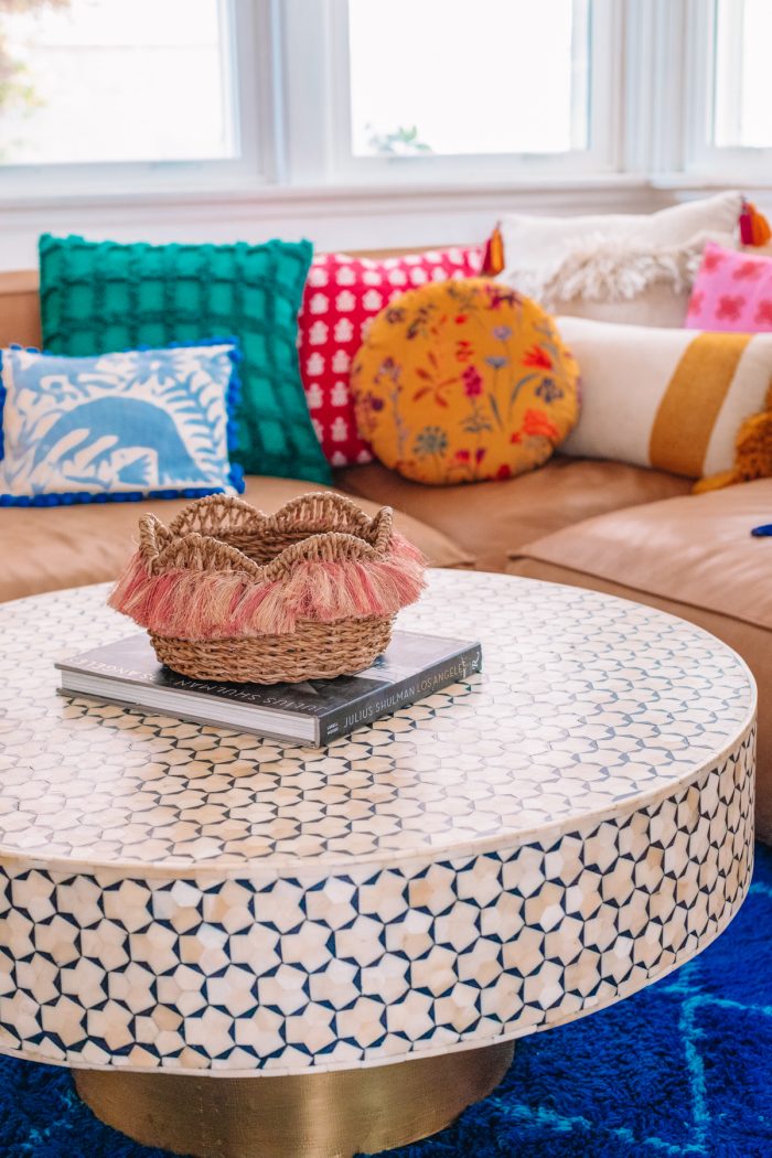
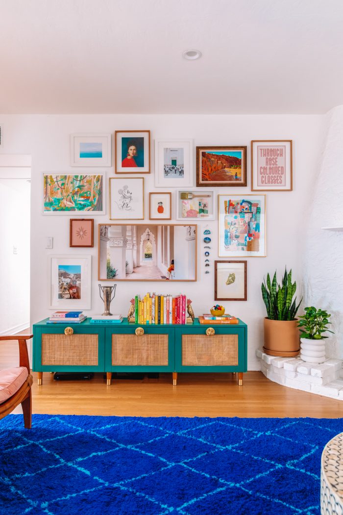
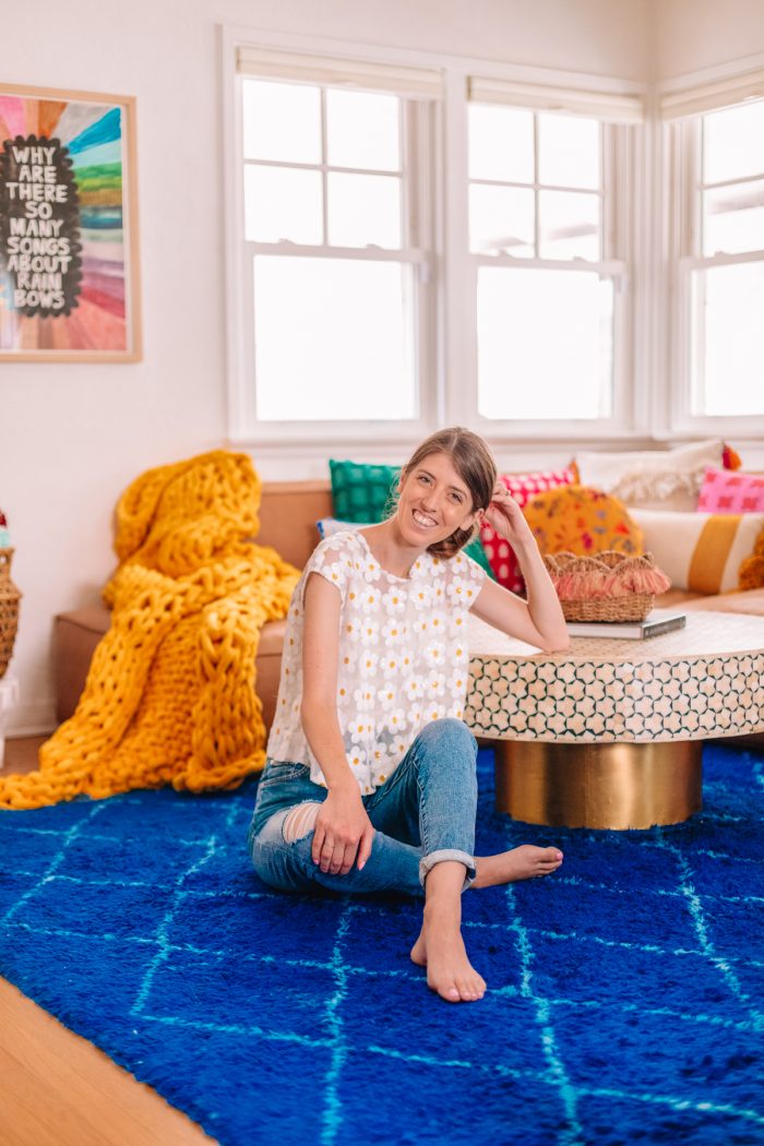
Since the couch was neutral, we layered a vibrant blue Moroccan rug from Demaroc Home underneath, and tons of colorful throw pillows (linked in the source guide at the end of this post!) and a bold yellow weighted blanket on top!
Our 1930s Fireplace
Other than the arches, this fireplace was one of my favorite features of the room! We kept the fireplace styling quite simple to let the architectural details speak for themselves. It also gives me a blank slate for layering in holiday decor, which I go all out on. 😉
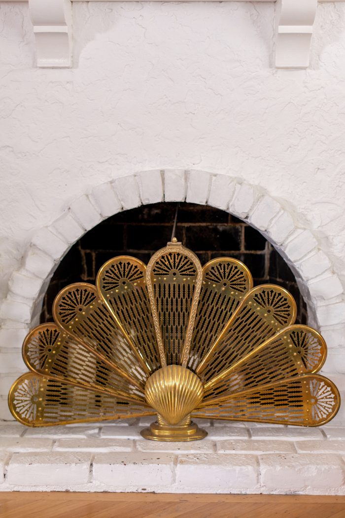
My favorite addition to the fireplace was the vintage peacock fireplace screen I found on Etsy. You can find other similar ones here! It perfectly compliments the round opening for the fireplace, and hides the less-than-pretty interior.
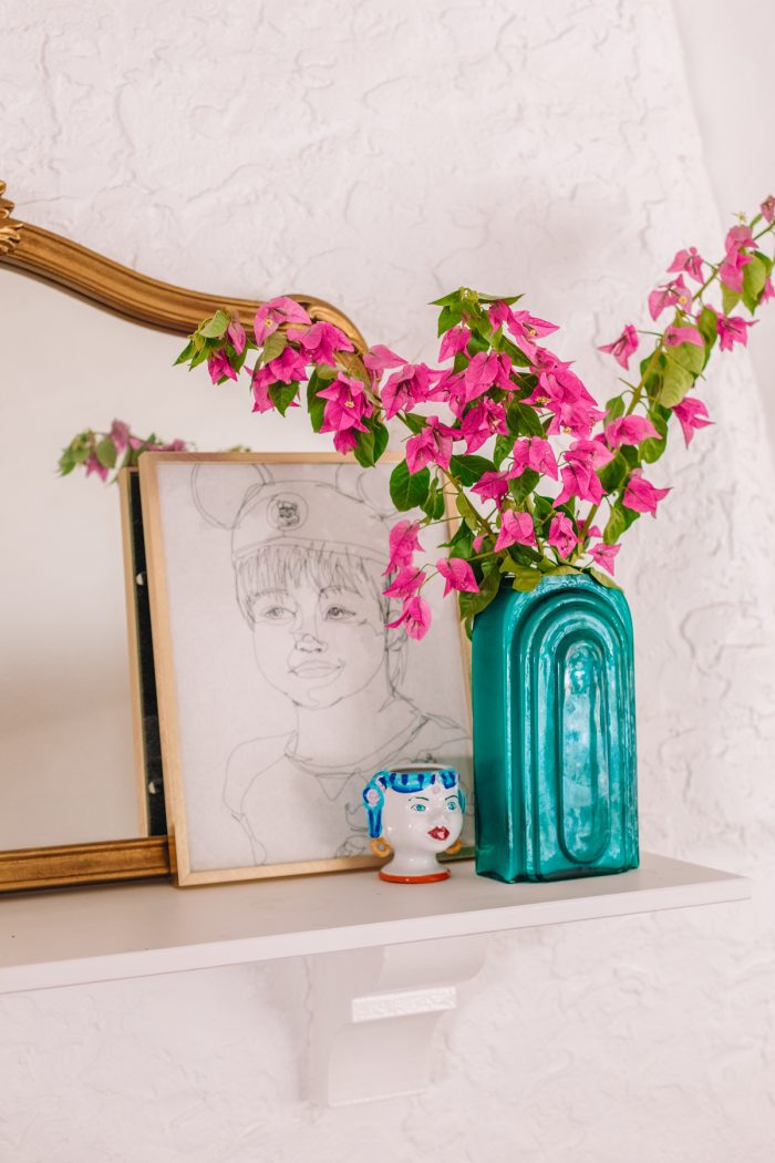
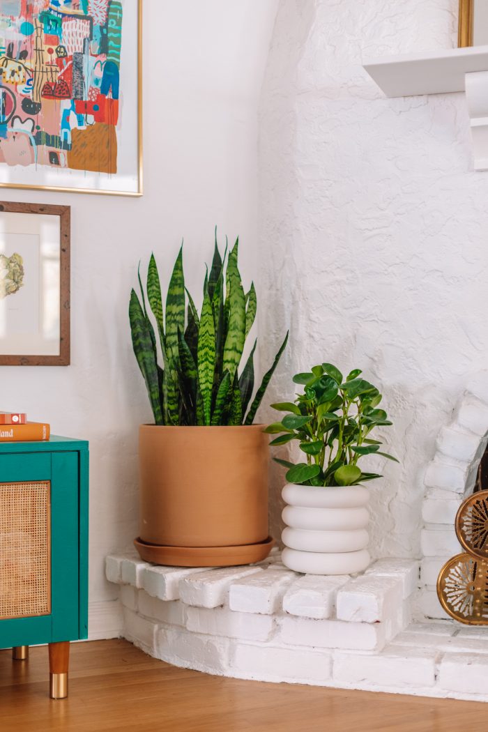
We added a vintage-style mirror on the mantle and an incredible freehand machine embroidered portrait of our son from Michael-Birch Pierce. Lastly, we brought in some plants from our favorite local plant shop, Folia Collective.
A Colorful Living Room Gallery Wall Around the TV
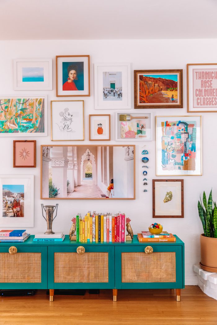
That largest “photo” on our wall below is actually our TV! It’s the Samsung Frame and it’s perhaps our favorite possession. The TV felt a bit to small on it’s own, so we decided to build a gallery wall around it to fill the space.
You can read my tips for curating and creating a gallery wall here!
Discreet Toy Storage: Our DIY Rattan IKEA Besta Hack
Underneath the gallery wall, is a DIY rattan IKEA Besta hack I made. I will share the tutorial soon! We chose the drawer option and that’s where we store toys for our son. We find drawers to be easier to simply toss things in quickly, instead of cabinets. Read about our philosophy on toys here.
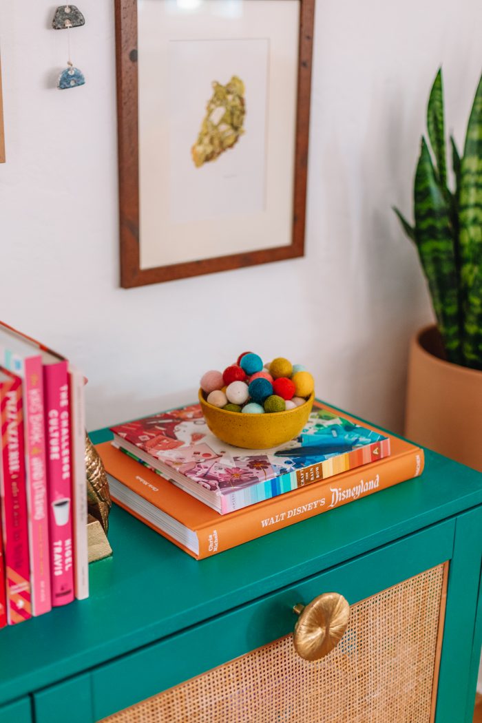
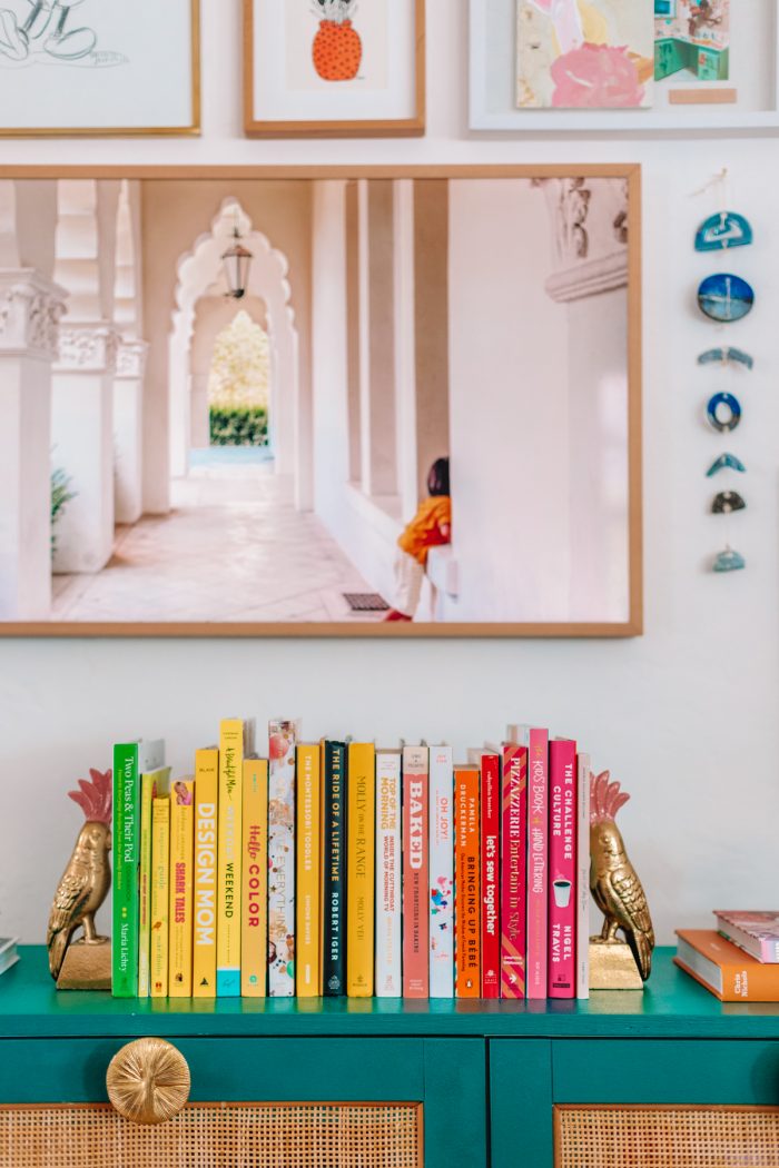
The surface was the perfect spot to display more of our book collection.
Additional Seating for Guests
Prior to re-doing this room, we had one large couch that we loved, but took up too much space and made it awkward for conversation with guests, as everyone had to sit in a row.
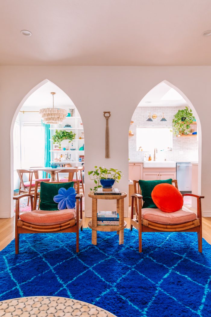
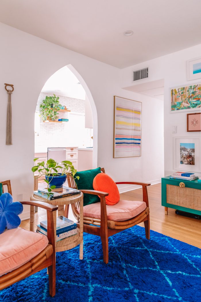
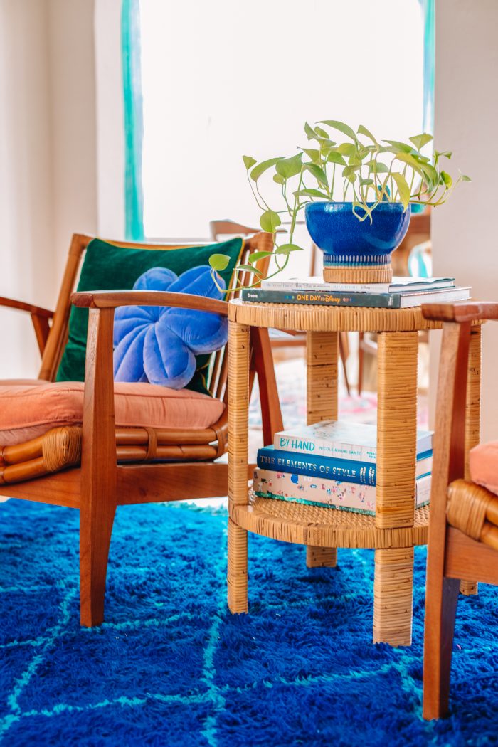
So with this new layout, we knew we wanted to create a secondary seating area. We did this with two oversized chairs and a small table in between.
By pushing all the furniture towards the perimeter of the room, we were able to open up play space for our son which was our biggest priority, but still make a comfortable and functional layout for conversation and entertaining in a small space.
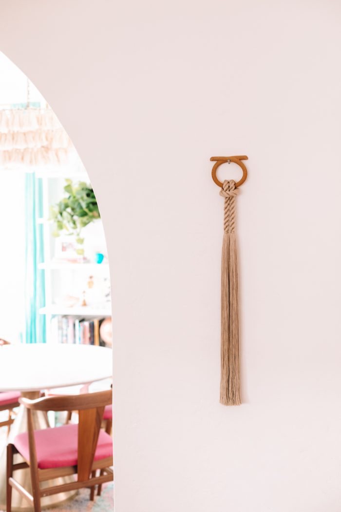
We centered the chairs against the two arches in our room, and added a custom piece from Cindy Zell. I wanted something that would draw your eye up, but still be neutral in tones as there was so much color elsewhere in the space. It’s perfect!
Photos by Jeff Mindell
Design by Kelly Mindell
Sources
Furniture
Modular Leather Sofa* | Bone Inlay Coffee Table (Similar here)
Rattan Chairs | Rattan End Table
DIY IKEA Besta Console (Tutorial coming soon!)
Pillows + Cushions
Pink Chair Cushions | Similar Green Velvet Pillows
Orange Round Cushion | Blue Flower Cushion from Kip & Co
Green Chenille Pillow | Hot Pink Chiapas Woven Pillow*
Mint Tenango Embroidered Pillow* | Velvet Tassel Cushions
Decor
Blue Moroccan Rug | Weighted Blanket*
Mirror | Peacock Fireplace Screen
Plants + Planters | Bird Bookends
Yellow Bowl | Felt Balls
Gallery Wall Art
Samsung Frame TV with Beige Bezel
Ocean Print | Portrait* | Italian Band Print
Mexico Painting (Personal) | Rose Colored Glasses Print
Everglades Print | Mickey Sketch | Orange Vase Sketch
Shadow Box (Personal) | Abstract Print | Star Embroidery*
Donkey Print | Ceramic Wall Hanging (No Longer Available) | Geode Print (Personal)
Gold Frames | Wood Frames | White Frames
Other Art
“Why Are There So Many Songs About Rainbows” Print
from Castle and Things (No longer available)
Large Stripe Art Print | Custom Embroidered Portrait
Cindy Zell Wall Hanging
We spend so much time in this room, especially now, and I’m so glad to have it done! It rarely (read: never) looks this clean because of all the purposes it serves, but that’s exactly how a colorful living room should be! =)
Studio DIY contains affiliate links. This means that we may receive a small commission on sales of products that are purchased through links on this site, at no additional cost to you. Product gifted to Studio DIY is indicated with an (*).





Karen says
Your living room is like living in a rainbow! So uplifting. That Besta hack looks like a winner, looking forward to the details.
Kelly says
Thank you, Karen!! Hoping to have the details up in the next two weeks or so!
Katie says
Love, love, love! I’m slowly trying to build a similar look in our new home and it’s really challenging to make all the color feel pulled together. You have totally nailed it! On my way to check out all your sources now!
Kelly says
It definitely can be tough, I think that’s why this room took me so long to complete! But I find if you repeat each color 2-3 times throughout the space, it helps. Even if some of those instances are really small (like one sliver of an art piece!)!
Lily says
Does this mean the garage is the *last* room reveal?! I’ll be heartbroken when they’re over! I love how distinctive and unique your style is, and I’ve loved seeing you play with all the rooms in your home.
Kelly says
I still have Arlo’s closet to reveal, and technically our second bedroom/office/nursery that is currently a storage room while we renovate!! Ha! Never ending!! But thank you, I really appreciate that!!
Julie says
Sorry to be THAT person…what size frame is the everglade print in? 24 by 36? I am thinking about getting a print from the artist and want to get the same frame.
Thanks!
Julie
Kelly says
Sorry for the delay, Julie! It’s the 27×18 size (but I cut the border down a bit to fit the frame, which was ~25×17!)
Julie says
thank you!!
Lauren says
Your home has turned out lovely, fun and happy! Thank you for sharing and taking the time to make it so uniquely beautiful!
Celeb Networth says
Oh my god the room is so gorgeous and vibrant! I love it!! I can’t wait to see the other rooms!
Mia G says
Absolutely magnificent! I love the rug you ended up with and how it all feels so cohesive without being monochromatic!
Elena says
Hi! I love this!!! Are the pink chair cushions the same ones you have or similar … the ones linked on world market look more like a throw pillow than a chair cushion? love love love your space!!!
Leila says
This living room is so gorgeous! What color white paint did you use for the fireplace and walls? I’m about to paint our living room white and there’s so many options I’m just stumped!
Lynn says
Hi- love your room!! Dying for the Besta hack! It’s so good.