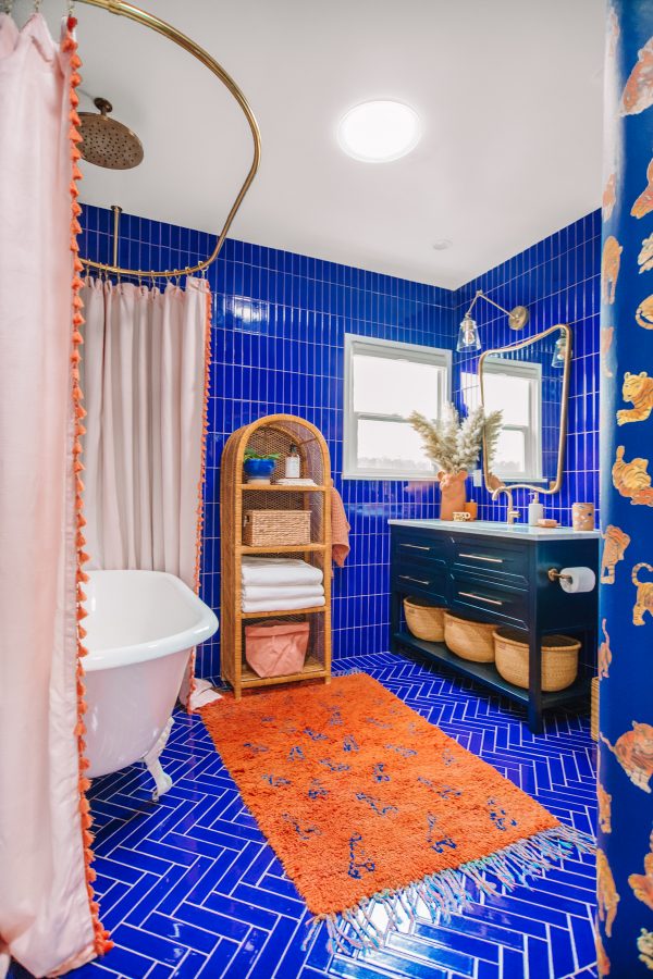
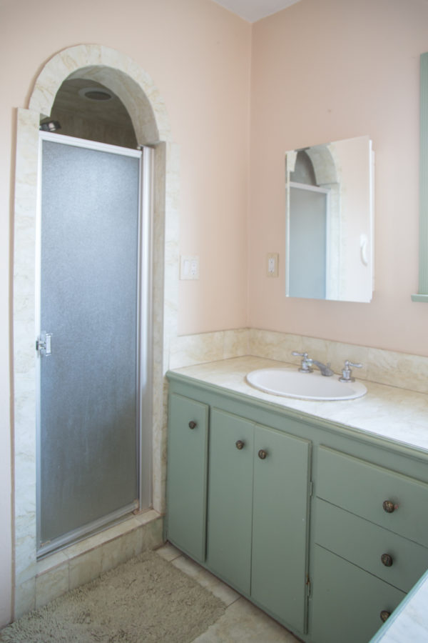
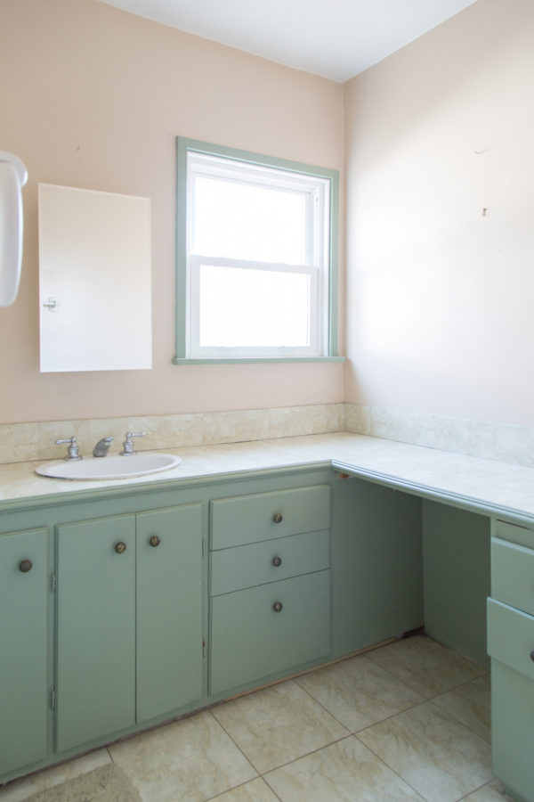
It’s DONE!! Our final renovation project on the main part of the house is COMPLETE!!!!! I couldn’t be more excited to share with you all today our new kids’ bathroom!! We took this space from a *literally* falling apart, awkward, old bathroom into this! An animal-inspired, jewel toned bathroom for Arlo and his future sibling(s)!
Now that I have a few renovations under my belt, I wanted to go even more bold with the space and I think it was worth it!! This was SUCH a fun space to conceptualize, and I got to work with so many awesome partners on it, like Build.com for all the main fixtures and Fireclay Tile for all the (AMAZING) blue tile! I’ll walk you through each area of the space in this post, but first… let’s take a look at where we started!
Just a *little* different, huh? 😉 Now let me walk you through the whole thing!!
Blue and Terra Cotta Bathroom Color Palette
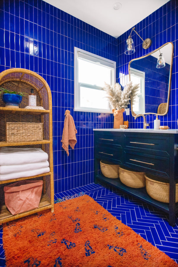
Since I had done a LOT of pink and green throughout the rest of the house, I really zeroed in on blue for this bathroom and I really wanted to do something dramatic by tiling almost the entire thing. I got to team up with Fireclay Tile again (we worked together on our master closet!) and they have an incredible range of color selections. All their tile is handmade here in California, too.
I spent about 100 days debating every single shade of blue they offered and finally landed on Azul 2×8 tile and it’s PERFECT! I’ve never done *this* much tile anywhere and I was super nervous but I am so happy with how it turned out. The space looks like a jewel box!!
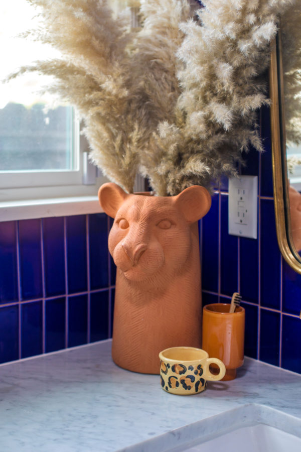
I still always crave some warmth in every room, so I knew I wanted to contrast the blue with warm accents and ended up choosing terra cotta after Arlo fell in love with this lion (ok, leopard?) vase that we bought and he aptly named “Cookie Lion.” She not only inspired the accent color, but also the eventual theme of the space… ANIMAL THEMED!!
A Theme Bathroom That Isn’t Too “Theme-y”
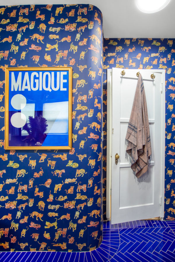
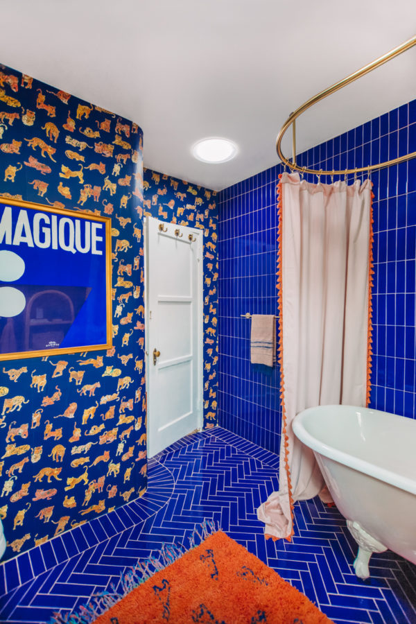
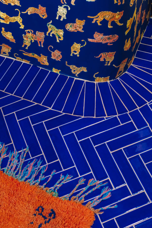
Kids spaces are my favorite to design because you can lean a bit harder into a theme (and, we all know, I LOVE a theme!). However, with a space like this bathroom that will also be used by our guests, I didn’t want it to veer too kid-like. I decided to make the main theme piece this AMAZING tiger wallpaper from Aelfie.
The wallpaper is on just one wall, that you can primarily only see once you’re in the bathroom. It’s almost like a little secret (just like Arlo’s yellow door!) and I love that. Outside of that, I kept the animal theme to a few ceramic pieces, and then if you look close enough you can see that the rug that I just HAPPENED to randomly find (I wasn’t even looking!!) has a giraffe print on it.
The Perfect Tub/Shower Combo
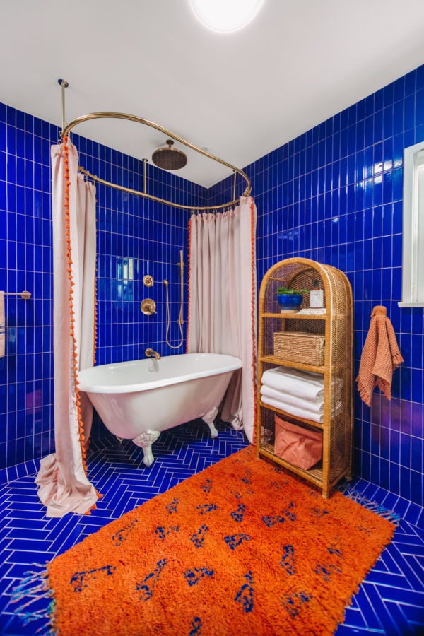
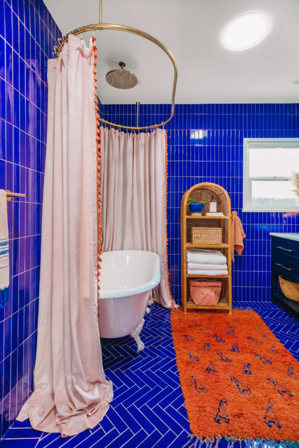
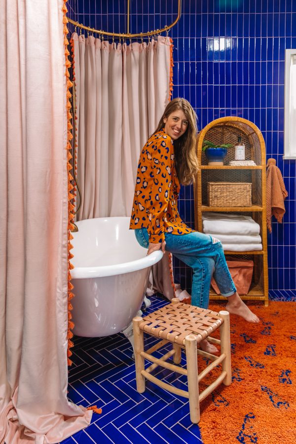
My biggest dilemma with this room was figuring out how to add a bathtub. We didn’t have space to have a separate tub and shower, and I don’t love traditional built-in tub/shower combos. I’ve always dreamed of having a clawfoot tub and after stumbling on a few pictures of ones that had been turned into showers, too, I decided that was the perfect solution for us. And I could NOT be happier about it!!!!
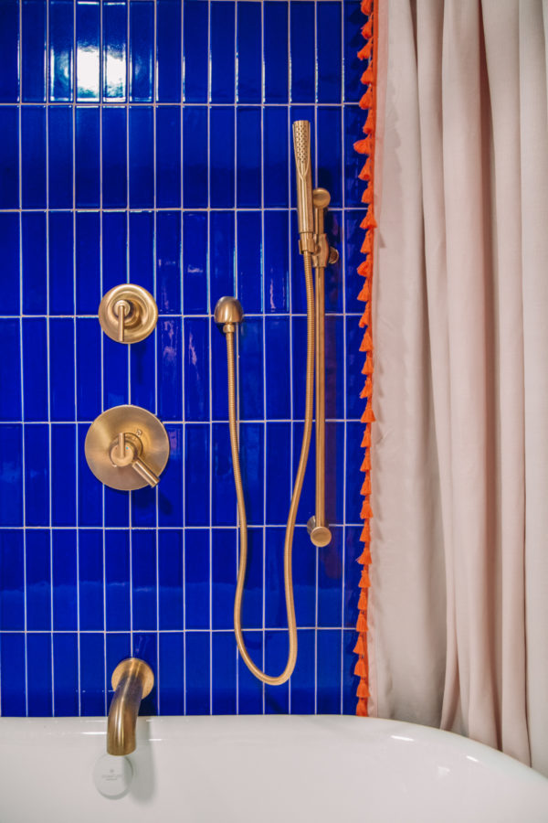
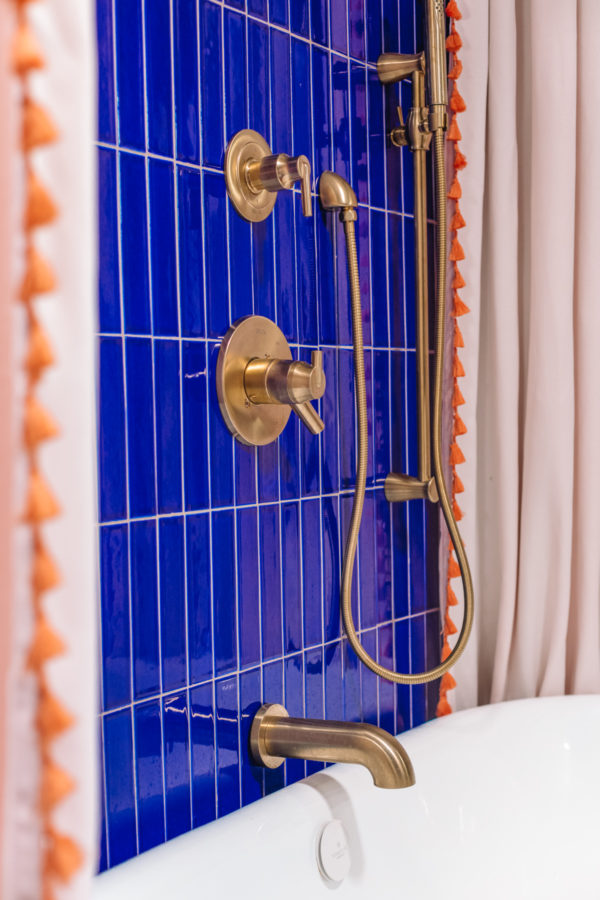
We chose this tub by Signature Hardware and paired it with an oval shower curtain rod that surrounds the entire tub. It is quite literally my dream tub. Since we used Delta Faucets throughout the rest of the house, it was really exciting to get to partner with them and shop their selection on Build.com for this space too! We did a tub spout, rain head and hand shower combo. If you have kids and are doing a bathroom renovation, I HIGHLY recommend including a hand shower if budget allows. Makes bath time much easier.
You can shop all the items we used for our tub set-up on Build.com right here! Build.com was a great resource and partner for this project, because they have such a vast array of brands, including some really unique items (like our vanity that I’ll talk about below!). The best part is that SO many of their items are in stock and ready to ship, which is hard to find in the renovation world.
Our New Vanity Area + Why I Picked It
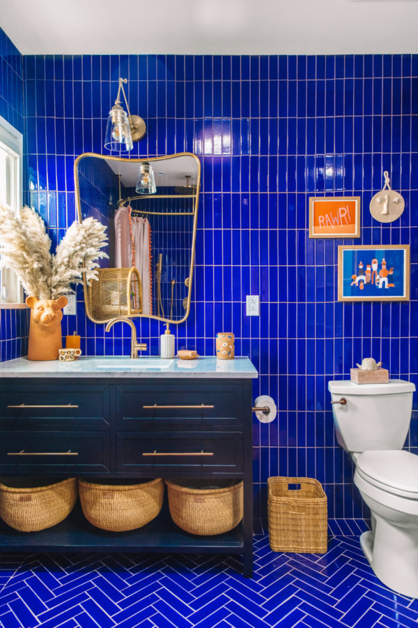
The previous bathroom had a wrap-around vanity that ended up with a lot of wasted space. I decided to push the sink over to the far wall to give us some more room. In the past, I’ve tried to avoid moving plumbing as much as possible but since this was the only spot where it needed to be moved significantly in the house, I felt OK going forward with it to give us more room by the tub.
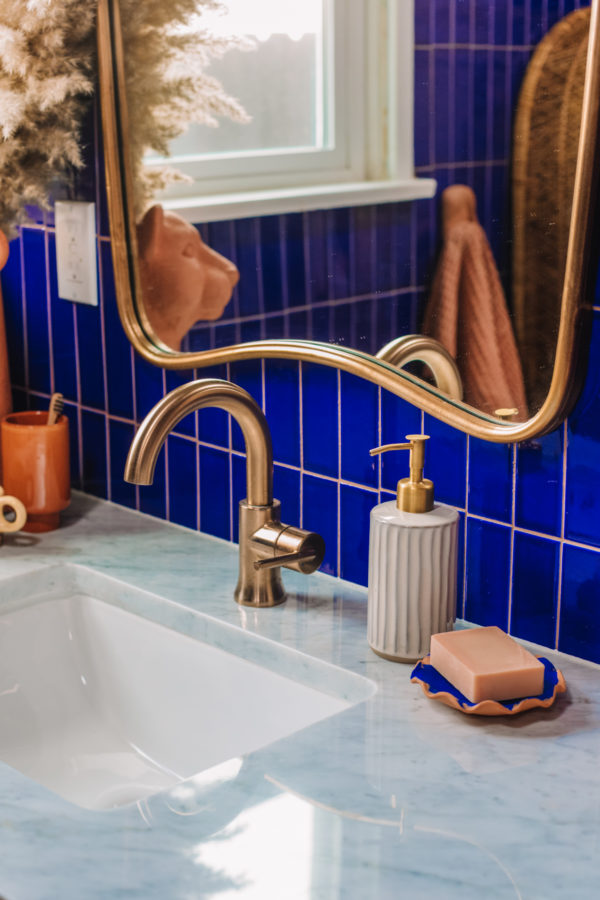
Quick side note: Arlo painted that soap dish on our Bahamas trip! I love displaying items he made in rooms besides just his own and showing him how proud we are!
To save money, on the flip side, we found this vanity from Signature Hardware on Build.com that was already navy blue (the color I needed it to be!) and already came with a countertop and sink. This saved us a lot compared to the vanity set-up we did in our master which we had to completely customize.
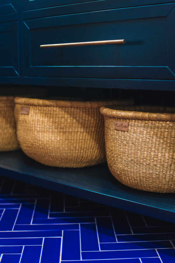
With so many hard surfaces and cool colors, I loved that the vanity had space for baskets below it to add in more warmth. I use them to store toilet paper, extra bath supplies and hand towels.
Bathroom Lighting
We loved having three sources of lighting in the master, so we decided to repeat that in this bathroom too. We worked with Velux again to add natural light to the space through perhaps our most favorite transformational tool: sun tunnels. They add an INSANE amount of sunlight without taking up a ton of space. The light really brings out the colors in the space, too.
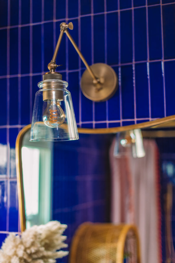
Then we added two sources of artificial light for the evenings: can lights (including one right above the shower) and a really beautiful adjustable sconce over the mirror. The ceilings in here are crazy high, so I love that the dramatic arm of this sconce balances out some of that height.
Fabrics and Wallpapers in a Bathroom
This bathroom will only be used for showers when we have guests, therefore we were able to incorporate some materials that aren’t always “bathroom friendly.” We used removable wallpaper on one wall, and repurposed regular curtains (which I’m adding a custom fabric shower liner too) for the shower curtains.
Since we know future homeowners of this house may use it differently, I ensured that these choices were all easily removable so they could be swapped out for something more practical in the future!
Mixing Patterns and Shades
I decided to use the same tile but in two different patterns. We laid it vertically on the walls, but did a vertical border and then herringbone pattern on the floors. This kept both a seamless blue look for your eyes, but with a bit of visual interest allowing the floor to make it’s own statement.
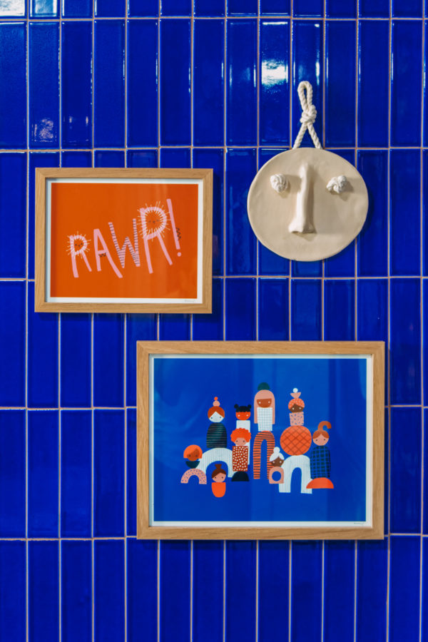
Similarly, I decided to choose items like the wallpaper, vanity and artwork that were slightly different shades of blue. I didn’t want everything to be too match-y match-y and the varying hues brought in a lot of depth.
Photos by Jeff Mindell
Sources
To make things easier, I put together a page on Build.com featuring all the major fixtures (including our tub, faucets, vanity, light fixture and hardware) from the bathroom! You can check it out right here!
Tile* | Wallpaper | Sun Tunnels*
Mirror from Anthropologie (Similar) | Hand Hook
Lion Vase from Target | Leopard Cup
Toothbrush Cup* | Allsorts Container
Market Baskets*
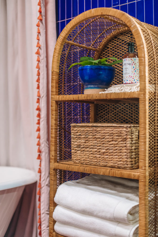
Rattan Shelf – Vintage (Similar here)
Blue Planter from Anthropolgoie | Striped Dish | Tubby Todd Soap
Fringe Hand Towels | White Towels*
Terra Cotta Waffle Towel | Striped Towel
Woven Basket | “Paper” Bag Basket
Shower Curtains | Leather Woven Stool | Trash Can
Magique Print* | Ceramic Face
Rawr Print | People Print
I think this room perhaps wins for the most dramatic Mindwelling transformation to date!? It was fun to take color to the next level in here, and have fun with a different kind of “kid” space. Arlo has been loving his new “Cookie Lion” bathroom and that’s what matters most!!!
*Indicates an item that was gifted in exchange for coverage on Studio DIY. All opinions are that of my own.
**This post contains affiliate links. If you click some of the links here and make a purchase, I may get a small commission at no additional cost to you! As always, I only support and recommend products I love and/or have tried myself. Thank you for supporting them, too!




Chelsey G says
Holy COW! This is so incredible. The textures and depth of colour is mind blowing! So so beautiful. You guys need an HGTV show!
Kaitlin Kirchner says
That cobalt blue is TO DIE FOR! This bathroom looks soooo high end, but at the same time so homey! Love the use of complimentary colors!! Just so so beautiful!
INLAY TABLE TOP says
thanks for sharing this beautiful blog
Katie Jardieu says
I love how bold this is! I never know how to layer the same color and this is such a great inspiration!!
Sarah says
So fun! How do you hang things on the wall since it is tile?
Lauren says
The blue tile is INCREDIBLE!!!!
Paige Cassandra Flamm says
Oh my gosh, all that blue tile work is amazing!
Paige
http://thehappyflammily.com
patricia galvan says
Oh wow! This is amazing!! You need your own tv show on HGTV!
Layne says
100% wish our boys bathroom had tiled walls. They are not that great at aiming, yet. The walls are suffering… This is stunning.
Kristina B says
I’m OBSESSED with this color tile and the person who installed it KILLED it on the rounded walls you have! CLAPPING EMOJIS.
Another winner Kelly!!!
Mia G says
I’m with everyone else — I LOVE IT!! So fun and whimsical!
Meredith says
It’s so bold, and looks so good!! That tile is fabulous! I really like the vanity, and the baskets you added there.
Christina says
Hi, I searched all your lists and can’t find a link to the shower curtain ring. I’m actually looking for a brushed gold, ceiling mounted ring and can’t locate one, so I would appreciate you sharing where you found yours! Thanks.